
Monday Musings (5/13/19)

Maps don’t have to be accurate. In fact, many of the best maps are inaccurate. On purpose.
Every map serves a goal. Sailors use maps to navigate the distant seas, pilots use maps to navigate the expansive skies, and drivers use maps to navigate the winding pavement. Often, they shine because they’re not accurate.
For example, the map of New York’s subway shrinks the massive borough of Staten Island and makes Manhattan look bigger than it really is. And yet, because the map is so inaccurate, it’s easy to read.
Believe it or not, maps weren’t always easy to read.
In 1933, Henry Beck saw that the London Underground was too hard to understand, so he simplified the subway map. He controversially abandoned geographic accuracy, which was the standard for maps until then. Instead, Beck focused on connections between trains and the network of stations.
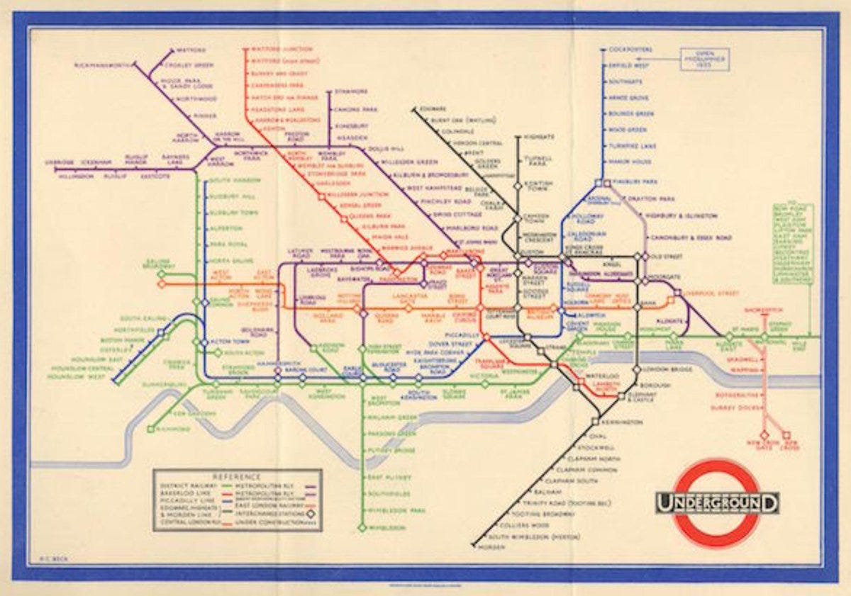
People who look at subway maps want to see the station names and the path of each subway line. If they need to transfer, it should be easy for them to find the connection point.
The faster, the better.
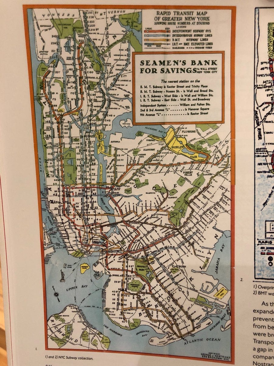
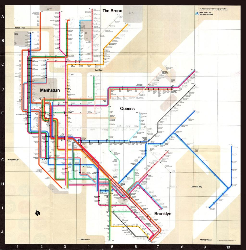
There are many ways to visualize a city. The old map of the New York subway system (shown below) is ugly and hard to read. The colors are dull, the trains are hard to follow, and the information hierarchy is poorly presented.
For years, the New York subway map was hard to read and even harder to use. Then, Massimo Vignelli arrived. By combining graceful sans-serif fonts with straight lines and bright colors, he transformed the New York subway map.
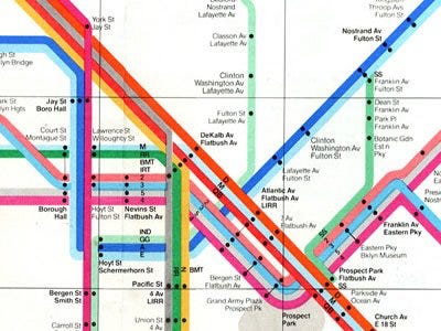
Since the Vignelli map serves the needs of the commuter, it’s geographically inaccurate. Rather than drawing the map to scale, the map expands the dense areas and contracts the sparse ones. Manhattan, where most of the action takes place in New York, is bigger.
The hierarchy of information is clear. Since the borough names are big, readers can orient themselves quickly. The dots make it easy to find your stop. Each subway line has its own bright color, which makes it easy to differentiate between subway lines. The bright colors make it easy to differentiate between subway lines. There are no messy angles. Rather, all the lines run only at 45 or 90-degree angles.
Plus, the Vignelli map is beautiful.
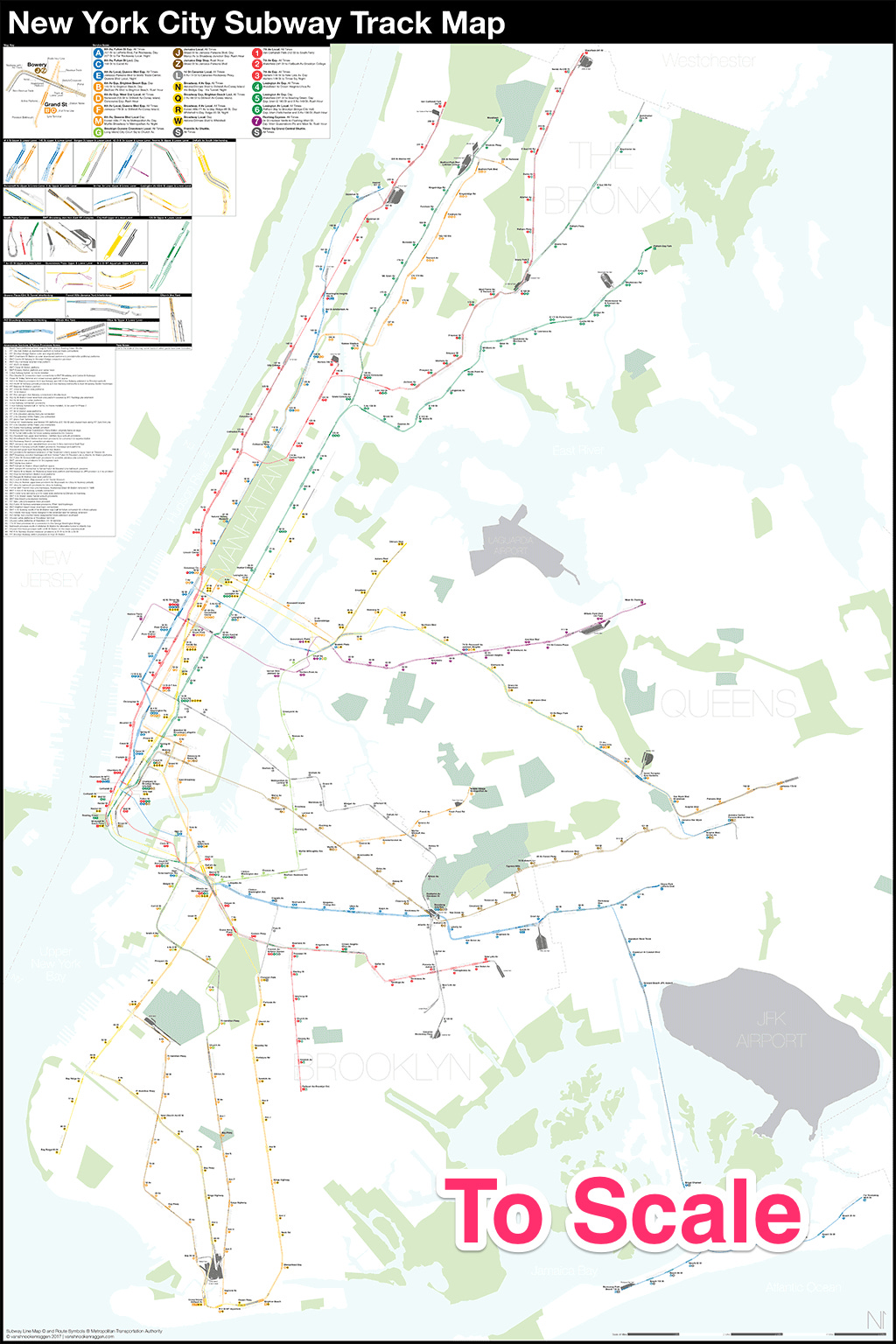
If you look closely, you’ll see Vignelli’s influence in the modern New York subway map.
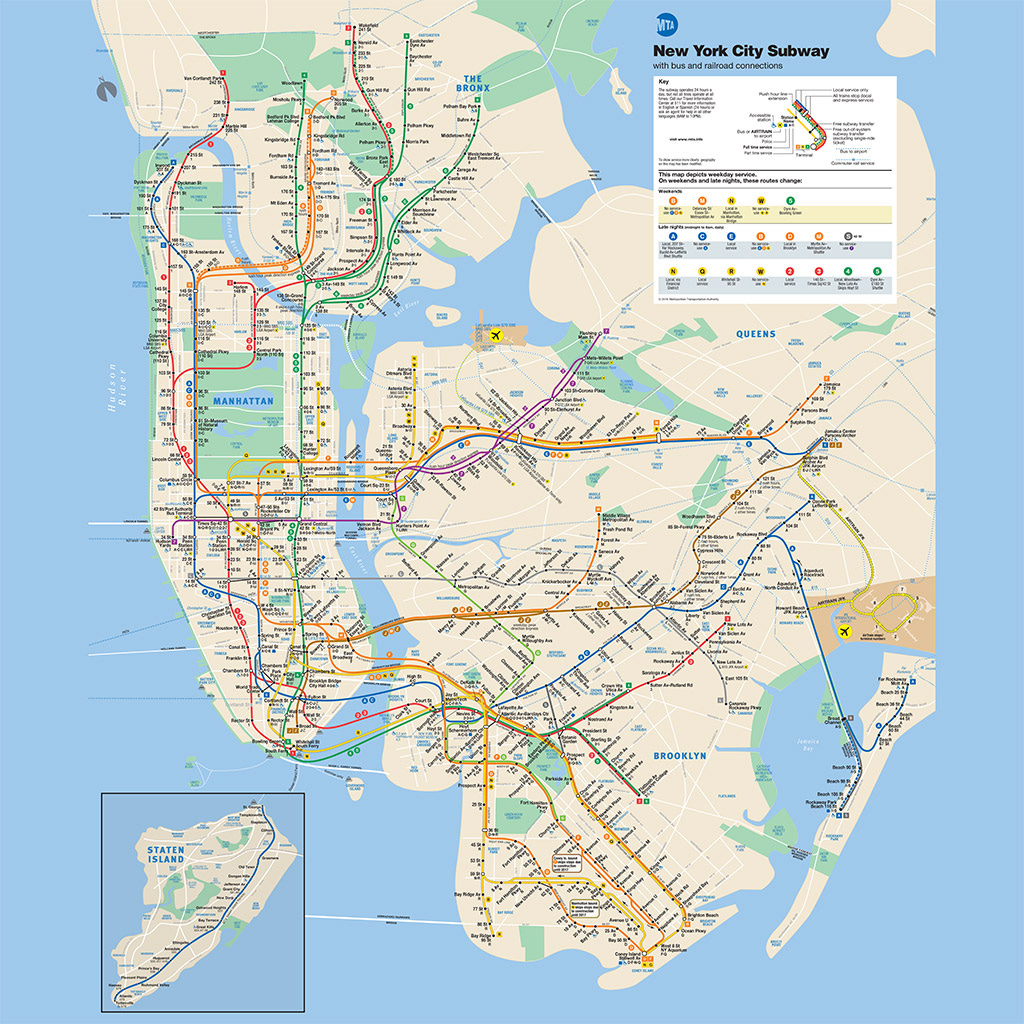
Compared to Vignelli’s design, the modern map adds information without compromising utility. For example, in Vignelli’s map, Central Park is a square. But in the modern map, the Central Park rectangle reflects its true shape. To guide tourists, it covers more than the subways.
The name of the map on the top-right corner is “New York City subway with bus and railroad connections.” It highlights bridges, airports, tunnels, the PATH train across the Hudson River, and ferry routes to New Jersey and Governors Island.
And like many well-designed maps, the modern map is inaccurate.
Fresh Ideas
North Star Podcast: Austin Rief
Austin is the co-founder of Morning Brew, a daily email newsletter with the latest news from Wall Street to Silicon Valley.
He started the company when back when he was a student at the University of Michigan. And now Morning Brew has more than 1 million subscribers.
Discussion points:
Morning Brew’s early growth strategies
Email growth strategies
Power of exclusive content for loyal subscribers
Listen to the podcast here: iTunes | Spotify | Website
Coolest Things I Learned This Week
The History of Flight
The world’s busiest airport in 1930 was in the oil boomtown of Tulsa, Oklahoma, which served more airline passengers than London, Paris, and Berlin combined.
People flying in 1930 were roughly 200 times more likely to be killed than the passengers of forty years later.
Against Specialization
From Gregory Chaitin, a mathematician and computer scientist:
“My attitude was one of slash and burn. Quickly get an idea of what’s in the field, criticize it to death, propose an alternative view. And say ‘maybe the maybe people aren’t seeing their hand in front of their nose.'
I don’t consider myself a specialist. I’m not afraid to go into a field where I know very little and criticize the prevailing dogma and think of maybe alternatives, which means I have to be comfortable with not knowing and with not being a specialist. But that gives me more freedom because the people who are specialists are really stuck in all the existing current framework.
So fashion is evil. And I think that talented people should be against fashion and against the ideas of the majority. Fight the system. Find a way to ignore it and do your thing.”
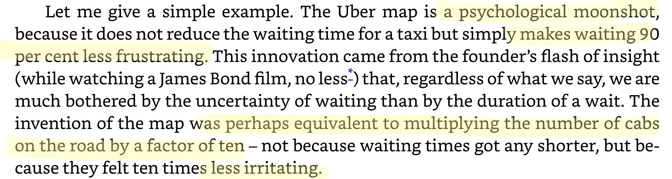
How James Bond Inspired Uber
This is the story of Garrett Camp, one of Uber’s co-founders. It takes place right before the company was founded.
From an excellent podcast called Acquired:
“He was going out at night and going to nightclubs in San Francisco. He was having a terrible time getting back home because there were 1,500 taxi medallions for all of San Francisco, which is a major city so he couldn’t get around. During the day, he was watching James Bond movies and he was watching Casino Royale and there’s a scene in the movie where Bond summons his car with his phone. This has happened in a bunch of movies, but in the Casino Royale version of this, on his phone, Bond is watching on the screen, on a map as the car is coming to him. And Garrett’s like… ‘Woah… that’s super cool.’
Then, over the weekend, I read a book that called Uber a psychological moonshot:
How FOMO Saves You
The best way to get people to do something boring, but important is to make it fun and exciting. In this case, activate FOMO (fear of missing out):
Bulls and Bears
Traders call rising markets bull markets and falling markets bear markets. According to legend, these terms originated from morbid contests that promoters once staged between bulls and bears. Bulls fight by thrusting upward with their horns. In contrast, bears fight by striking downward with their claws. This image has generated a small cottage industry of artisans who create bull-fighting-bear sculptures that traders buy to adorn their offices and living rooms.
Photo of the Week
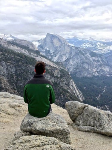
Ahhhhhh… Yosemite. In the photo above, I’m looking at Half Dome, one of the most iconic mountains faces in the world.
I’m reminded of Yosemite because I used to be the “navigator” for every family road trip. Every October, my family drove four hours from San Francisco to Yosemite. The old, crumpling AAA maps were my responsibility. But most importantly, the navigator received privileged access to the front right seat of the car.
As I kid, I spent tons of time at the sacred national park but never appreciated its beauty. We did so every year until the end of middle school. But then, in high school, once I started playing competitive golf, I stopped visiting Yosemite and didn’t return for almost a decade.
That changed in 2015 when this photo was taken. This was the most memorable hike I’ve ever done. In five hours, we hiked through Yosemite valley, around some fresh water lakes, and right over Yosemite Falls — a 2,425 feet foot waterfall. Unforgettable.
Until next week,
David Perell
P.S. Do you enjoy Monday Musings?
If so, there are two ways you can help me:
Send the newsletter to a friend or encourage them to sign up here.
Rate and review The North Star Podcast. It helps people find the show, and will take you less than 30 seconds.
Monday Musings takes a few hours to write each week. The more people who subscribe, the more time I can invest in writing Monday Musings.